Variable Fonts
Tipografía flexible y adaptable en un solo archivo.
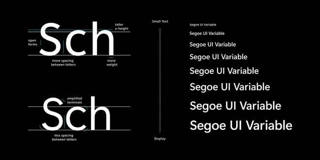
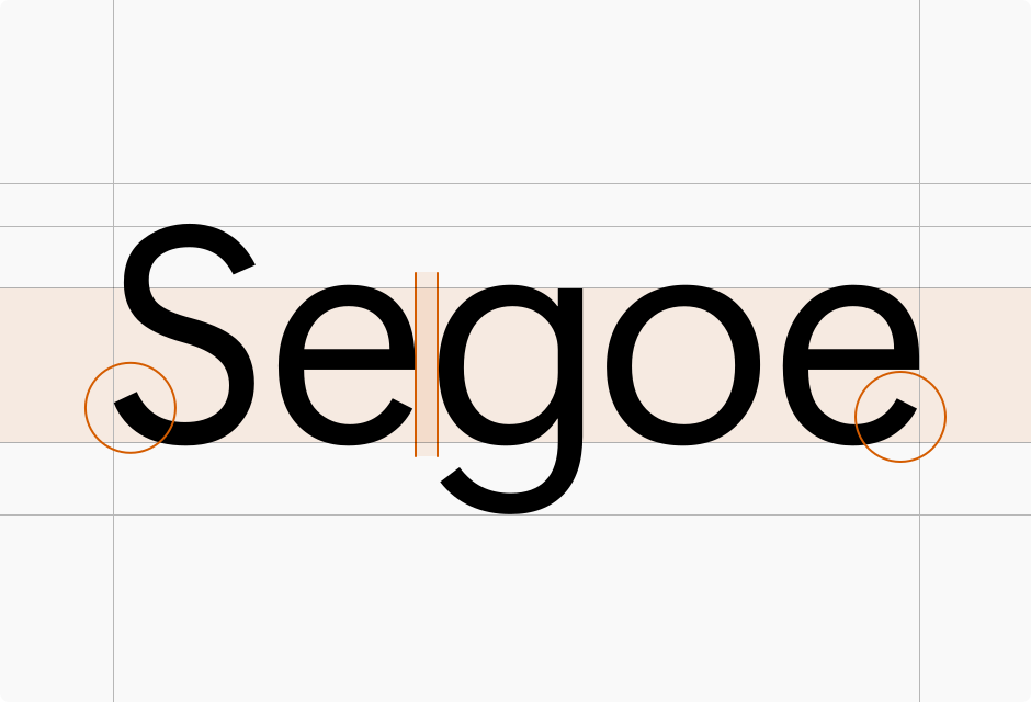
The magic of variable fonts lies in “axes.” The most common axes are Weight (thin to black), Width (condensed to expanded), and Slant. However, type designers can define custom axes. A font could have a “Serif” axis that morphs it from sans-serif to serif, or a “Casual” axis that changes it from formal to handwritten.
This allows for infinite granularity. Instead of being stuck with font-weight: 400 or 700, a designer can choose 532 if that is what looks best in a specific context. It offers a level of typographic control previously reserved for print design.
Performance and Responsiveness
By reducing the number of HTTP requests and total file size, variable fonts significantly improve website performance. But their true power is in responsiveness.
Designers can now adjust typography dynamically based on the screen size or user context. A headline might be wide and thin on a desktop monitor but automatically condense and thicken on a mobile screen to maximize readability. This “fluid typography” ensures that the reading experience is optimized for every device.
Visual Gallery


Animation and Interaction
Variable fonts are perfect for animation. Because the variations are mathematical interpolations, you can animate the font-weight smoothly from 100 to 900 using CSS transitions. This opens up new possibilities for micro-interactions: a link that gets bolder when you hover over it, or a headline that reacts to the scroll position.
It brings text to life, making it an active participant in the user interface rather than just static content.
Key Characteristics
- Single File: Reduces HTTP requests and improves performance.
- Continuous Variation: Infinite control over weight, width, and other axes.
- Fluidity: Smooth animations between states.
- Responsiveness: Adapts legibility to different screen sizes.
- Custom Axes: Unique stylistic controls defined by the type designer.