Data Visualization Design
Transformación de datos complejos en visuales comprensibles.
Data Visualization Design is the practice of translating information into a visual context, such as a map or graph, to make data easier for the human brain to understand and pull insights from. In the age of “Big Data,” where we generate quintillions of bytes of data every day, the ability to synthesize this noise into a clear signal is one of the most valuable design skills.
Storytelling with Data
Good data visualization is not just about making pretty charts; it’s about storytelling. It guides the viewer through the information, highlighting trends, outliers, and patterns that would be invisible in a spreadsheet.
Designers use visual attributes like color, size, and position to encode meaning. A larger circle means a larger population. A red line means a decline in revenue. By leveraging pre-attentive processing (our brain’s ability to process visual information subconsciously), data viz allows us to understand complex situations in milliseconds.
Interactivity and Exploration
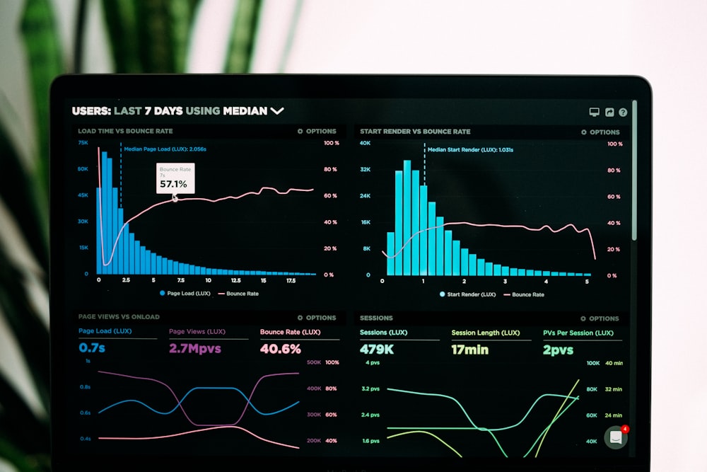
The web has transformed data visualization from static images into interactive tools. Users can hover over data points to see exact numbers, filter datasets to find what’s relevant to them, or zoom in to see granular details.
This interactivity empowers the user. Instead of being fed a single conclusion, they can explore the data and draw their own. Dashboards, financial apps, and fitness trackers all rely on this principle to make personal data actionable.
Visual Gallery



Aesthetics of Information
There is a growing trend of “Data Art,” where the primary goal is aesthetic beauty rather than pure utility. Complex datasets are rendered as flowing particles or abstract geometric structures. While these might not be the most efficient way to read a stock price, they are powerful for evoking the feeling of complexity and scale.
However, the golden rule remains: do not distort the data. Design should clarify, not deceive. Misleading axes, truncated scales, or confusing color choices can lead to false conclusions, which is a cardinal sin in data design.
Key Characteristics
- Clarity: The message should be immediately apparent.
- Integrity: Accurate representation of the underlying numbers.
- Interactivity: Tooltips, filters, and zoom capabilities.
- Hierarchy: Emphasizing the most important data points.
- Comparison: Making it easy to compare different data sets.